Product designer
@ Government of Ontario
Our team co-designed with the Ministry of Labour to increase employer compliance under the employment laws. This is a story of how we applied UX and content design principles to arrive at a comprehensive business toolkit, which empowers small businesses to navigate the intricacies of employment laws.
3 product designers
1 content designer
1 project manager
Client team
6 weeks
Nov - Dec 2020
Miro
Figma
Optimal Workshop
Google Trends
Hemingway Editor
The Employment Standards Act (ESA) is a legislation that governs employers and employees in Ontario. The Ministry of Labour has seen too many employer non-compliance under the ESA. This is where our team comes in!
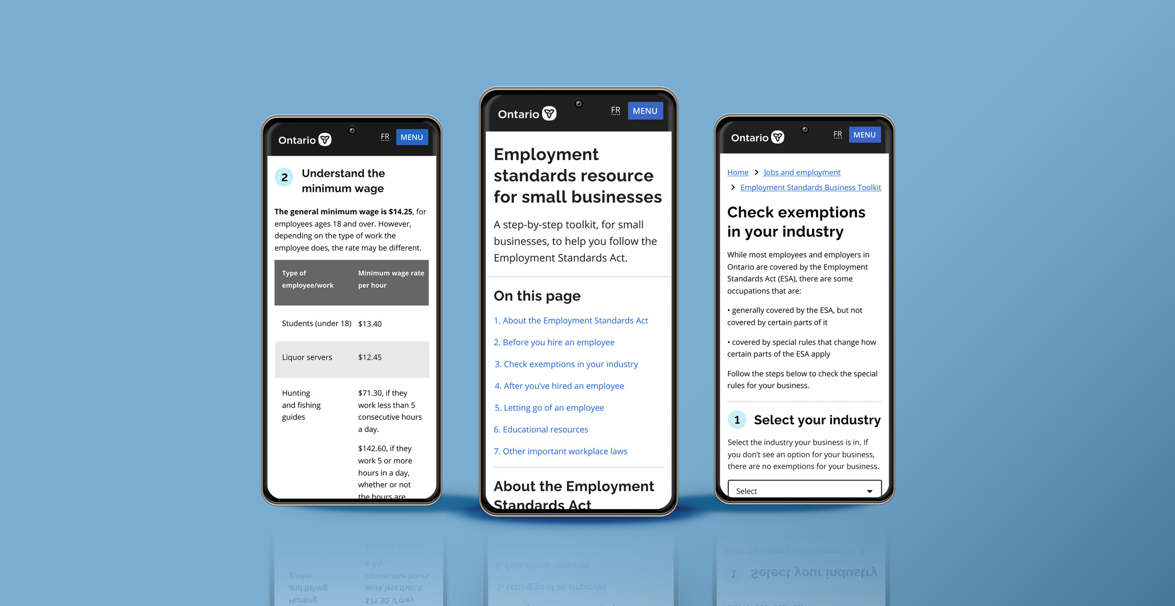
From user research, we found that small business owners struggle with the convoluted language and frequent updates of employment laws. As such, we developed a one-stop-shop business toolkit website with a focus on content design and co-design. We actively involved the client team to help them build their design knowledge and framework. Some of the key frames are shown below.
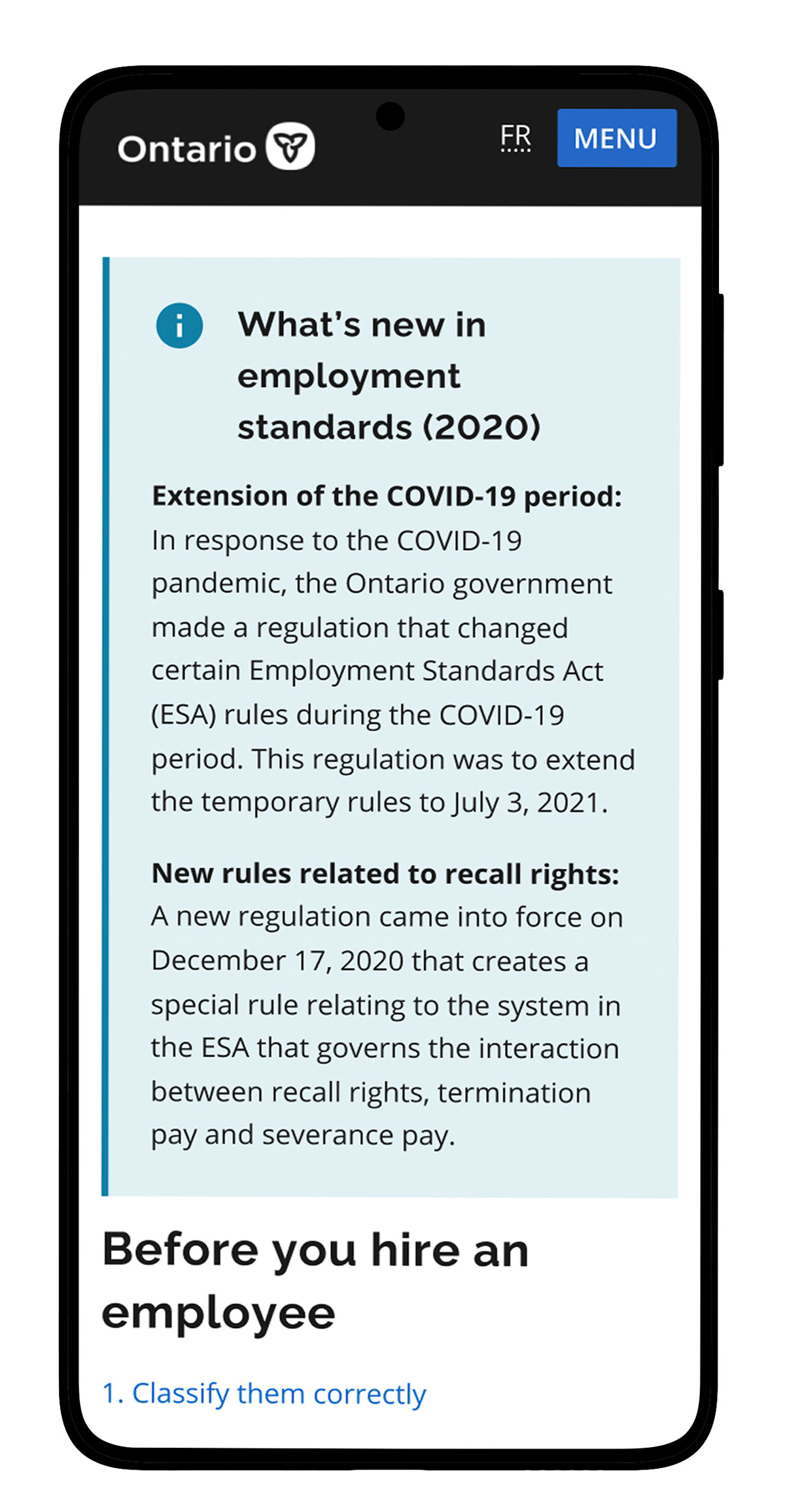
Summary of new changes:
Keep employers updated
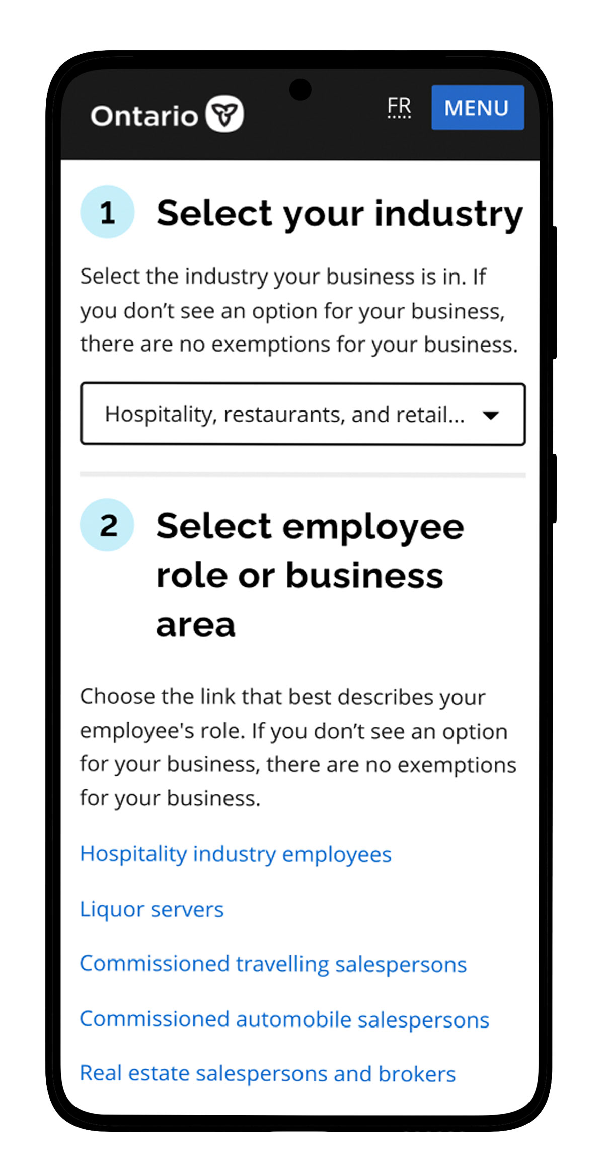
Exemption selector:
Communicate exemptions by industry
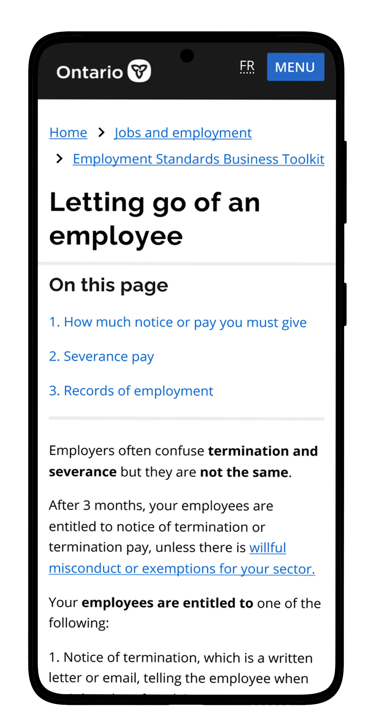
Termination vs severance pay:
Clarify common misconceptions
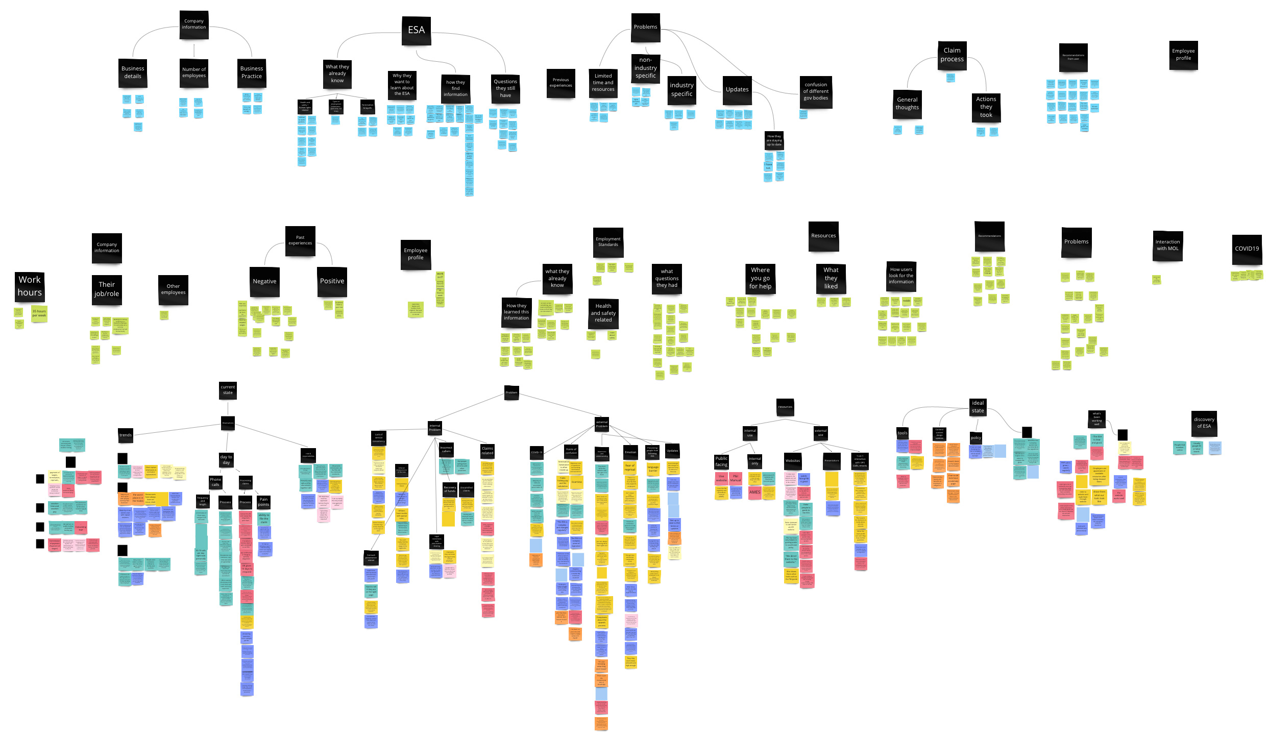
Research: recruited for and conducted semi-structured user interviews, developer personas, researched user language patterns, and presented actionable insights to clients.
Design: Led co-design workshops with clients to teach them human-centered design principles, created content during pair-writing sessions, used card sorting to develop information architecture, ideated solutions via crazy 8s, created lo-fi to high-fi prototypes, and conducted usability testing.
While knowing nothing about the ESA, our team jumped right in to educate ourselves on the legislation and understand our client's needs through workshops.
Although our clients want to design user-centric services, they don't possess the skills and knowledge. Our team will help them achieve their goals:
1) Learn how to design user-centric products and services.
2) Develop a new educational resource to increase employer compliance.
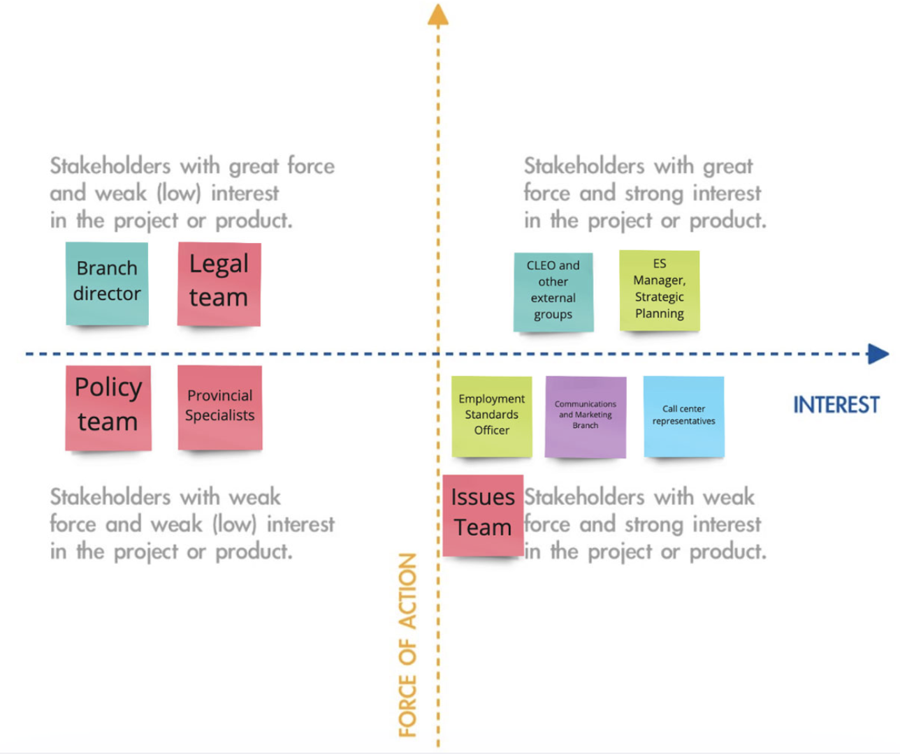
By identifying the key stakeholders, we involved people who have authority over the project through regular presentations.
We also found stakeholders to interview in order to understand the problem space better.
These were just the surface problems.
To help us surface the root cause, what else could be better than talking to the employees and employers themselves?
Between 2019-2020, there are over 18,965 claims filed against employers.
The call center receives over 80,000 calls from both employees and employers yearly, often about the same topics.

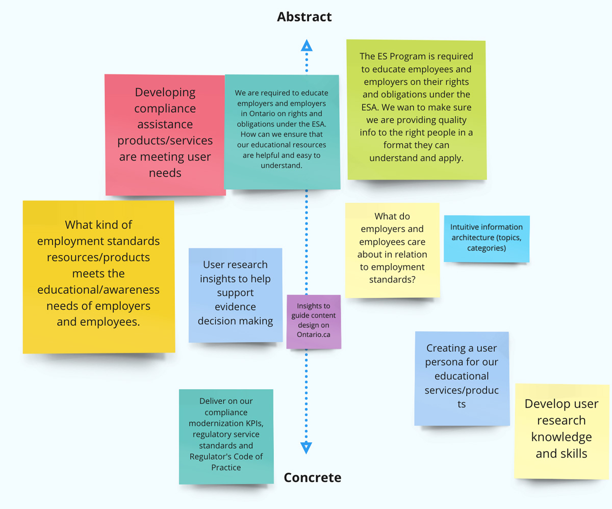
The problem above was the main research question we wanted to answer. Through a series of interviews, affinity diagrams, and personas, we arrived at the core content design problem with three actionable insights.
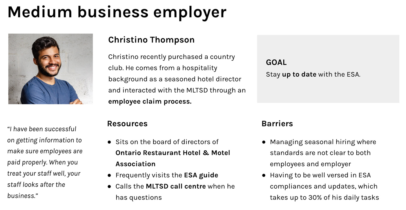
Small & medium business owners
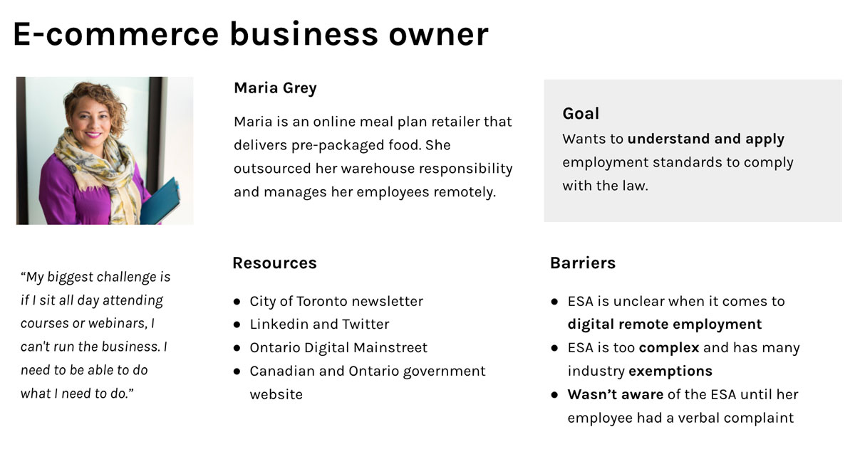
E-commerce business owners
Franchisees
Young workers
Newcomer employees
Employees with disabilities
Call-center staff
Enforcement officer
Policy specialist
Education outreach team
This "legal speak" is not inclusive and often reads something like this:
"If the contract does not provide a greater right or benefit, then the family responsibility leave standard in the ESA applies to the employee. However, if an employment contract provides for something similar to family responsibility leave, then if the employee takes the leave under the employment contract, the employee is considered to have also taken family responsibility leave."
On top of the confusing content, we arrived at three more insights from the affinity diagram.
The ESA has been changing yearly, making it difficult to stay up to date.
Employees and employers discover the ESA after an issue has already occurred.
People often confuse the ESA with health & safety, human rights, and federal taxation requirements, causing them to falsely assume that they are already following the ESA.
To help guide our design decisions and present to stakeholders, we created personas for the employers who want to follow the employment laws but unintentionally violates it.
We want to highlight these employers because the ministry sees more non-compliance among small to medium businesses and e-businesses.
Based on our user research, the client and design teams communicated what we thought the main problems were. This divergence in thinking helped us discover a wide range of problems and ideas. Upon converging, we arrived at this problem statement:
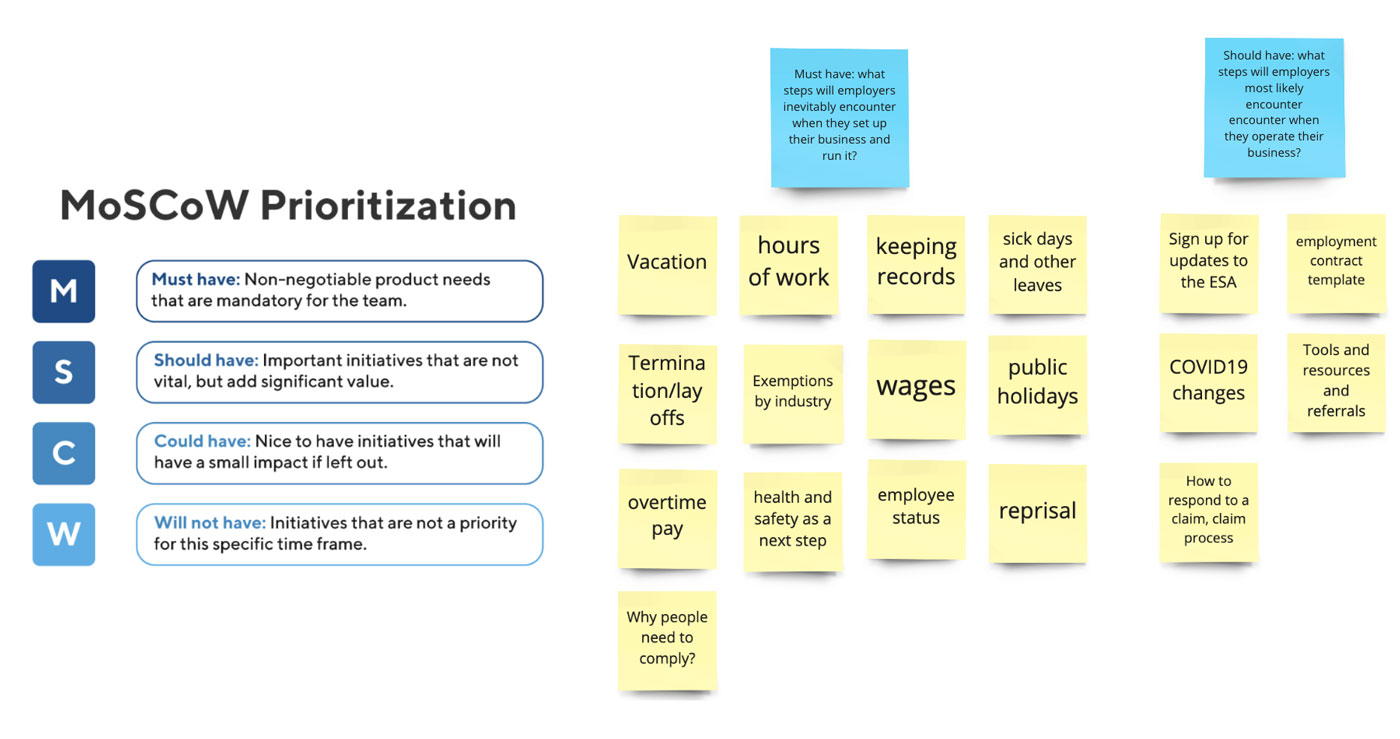
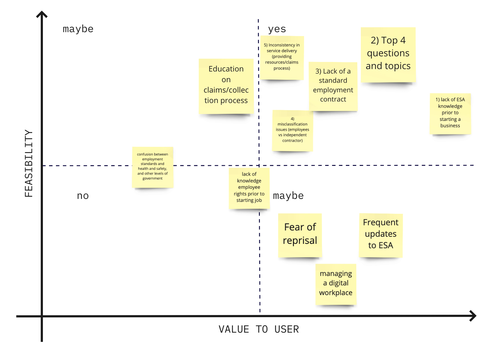
With limited developer resources and a short time frame, we simply couldn't solve all the problems.
Using the feasibility vs value-to-user decision matrix, we zeroed in on the key problems to tackle in the top right quadrant. The client team provided insights on the feasibility.
Then we communicated other root problems through a presentation with other responsible teams.
The organizational goals of the ministry include protecting employee rights while reducing operating costs. These are portrayed in the success metrics to evaluate the product.
On the other hand, our client is extremely limited by their technical ability. They need to update information regularly without having dedicated developers.
This evaluates the effectiveness of the content and user touch-points.
This evaluates the clarity and friendliness of the educational content.
We actively involved the client team throughout our user research and ideation phases to help them build their design knowledge and framework.
We individually brainstormed one idea per minute in a crazy 8 brainstorming session.
After grouping the ideas into similar concepts, we found some commonalities: a business toolkit that helps small to medium businesses.
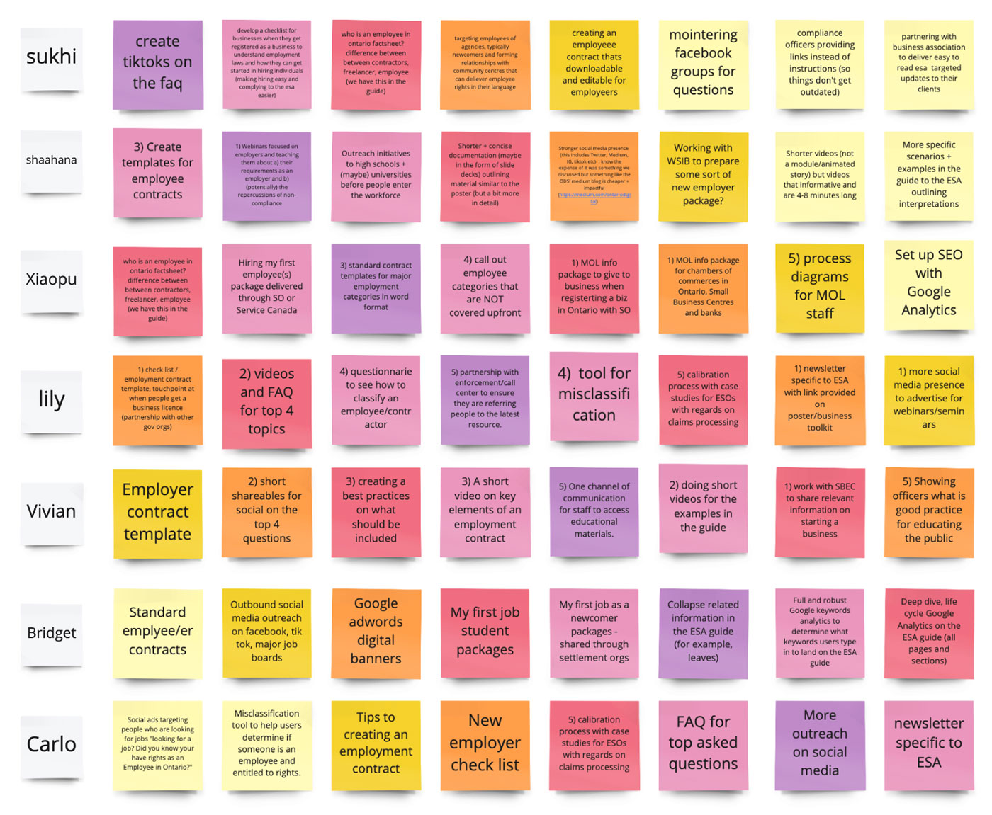
Next, I gave an information architecture crash course for our client.
Individually, we created our ways of organizing ESA topics. This divergence in thinking provided us with many great ideas to explore upon converging, focusing on a trigger event for the employer in the employment cycle.
Along with the problem comes assumptions. These were the assumptions we need to verify during subsequent design iterations.
We assumed that employers view ESA topics as obligations in different business phases, such as hiring an employee or while operating the business.
Based on user interviews, repeat ESA offenders are aware they are breaking the laws but are incentivized by the benefits. We assume the solution lies in enforcement rather than educational resource.
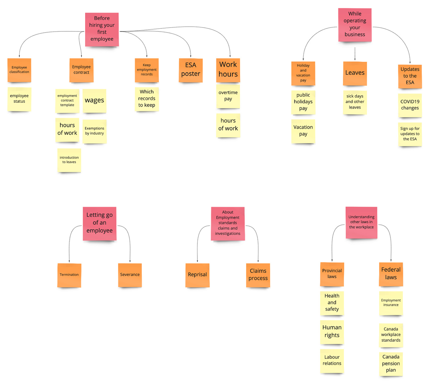
After laying down the groundwork, we took a mobile-first approach to our iterations! After exploring the checklist and timeline layouts, we arrived at our first set of wireframes!
One by one, we presented our ideas and dot voted on which layouts we wanted to pursue.
We wanted to explore a timeline and checklist visual layout to make the content more digestible.
The timeline layout (left) introduces the key topics under the ESA, which provides employers with a chronological navigation structure.
A checklist layout (right) offers the option for a printable check list to help employers keep track of their progress.
We noticed that the trigger events for the headline are not chronological. Here, letting go of an employee and responding to a claim aren't time progressions.
Therefore, we choose the checklist layout.
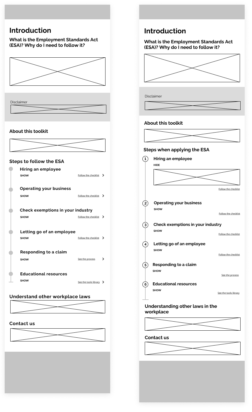
By combining the information architecture and checklist layout, we built the wireframes to quickly iterate on our design.
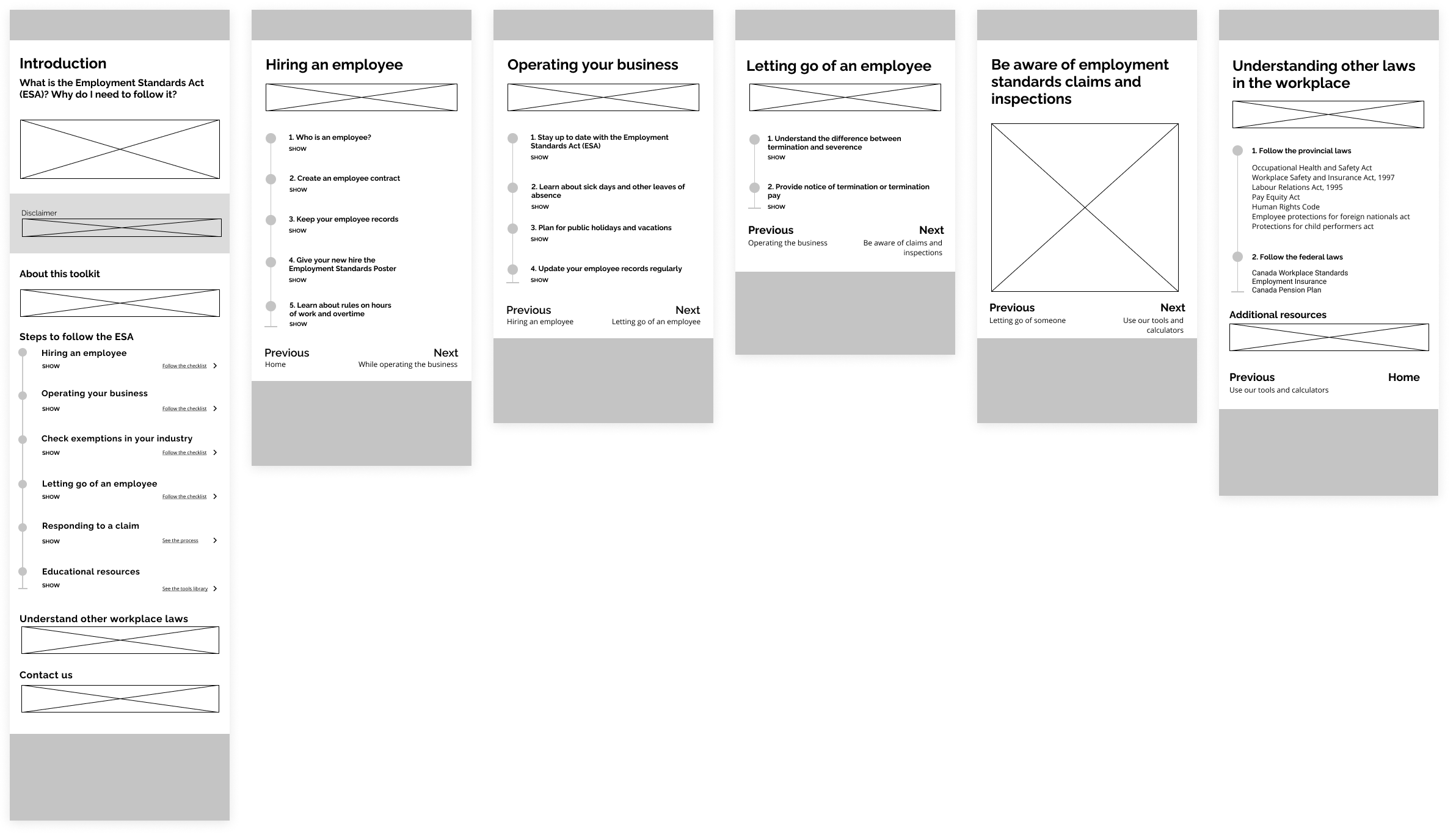
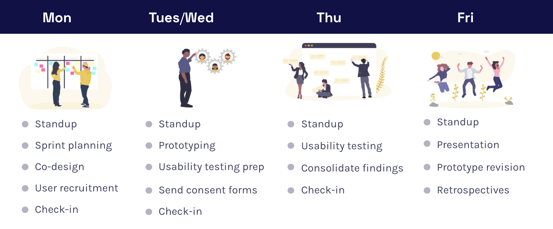
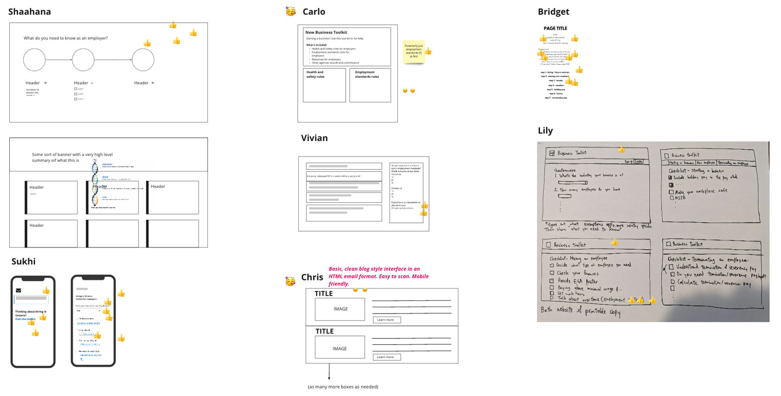
Using Google's weekly design sprint format, we completed 3 sprints from low-fidelity wireframes to high-fidelity prototypes! During this process, we conducted usability testing with 15 small to medium business owners.
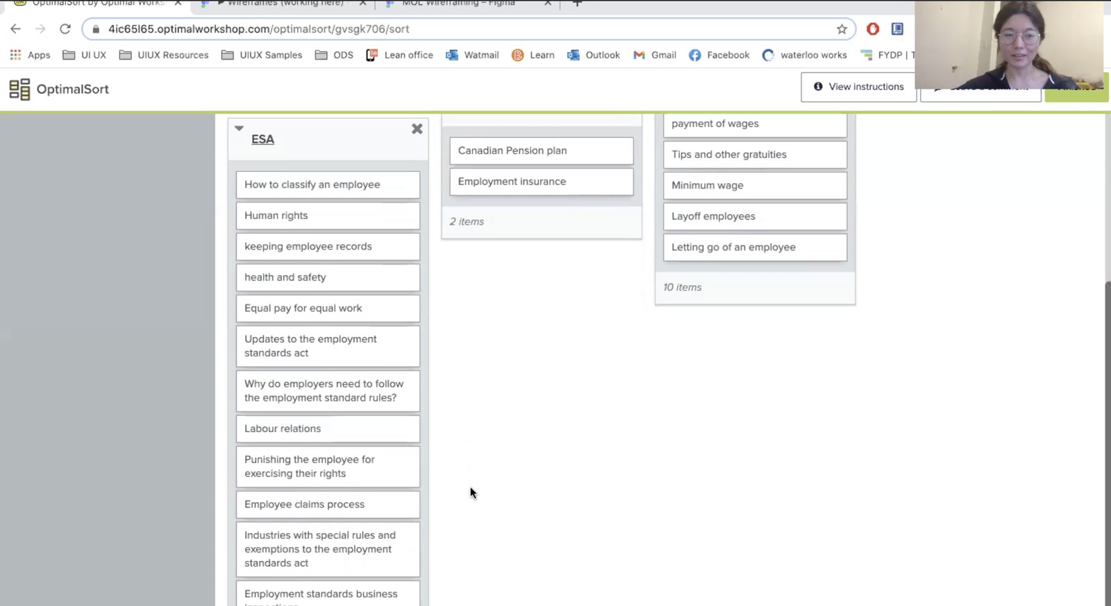
Is our information architecture actually how employers innately categorize the topics? To test this assumption, I used Optimal Workshop and prompted employers to sort topics and name the categories.
While most employers created hierarchies similar to ours, they often mix up federal and provincial requirements. To help this toolkit become a true one-stop-shop, we will incorporate content about federal regulations.
As a content-focused product, we iterated on the copies using the four content design principles.
Simple considerations, such as "what should we call this product" or "how can we de-politicize this heading", often turn into hours of discussions.
.png)
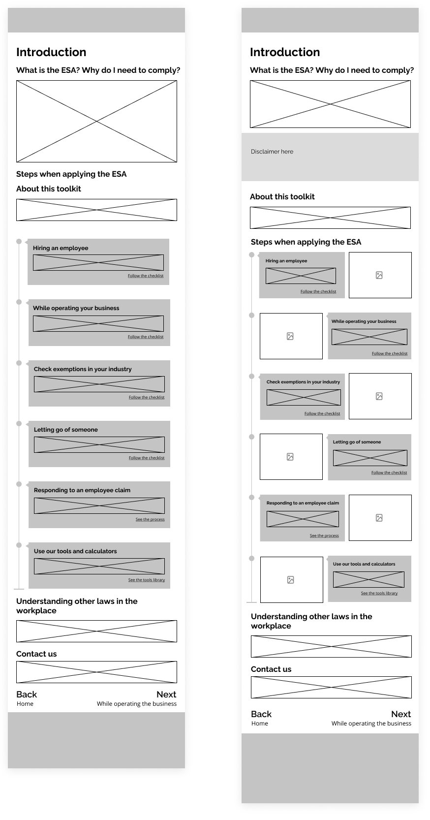
Problem: too many clicks and links crowd the page.
Solution: eliminate the show/hide buttons and simplify display as links for quick navigation.
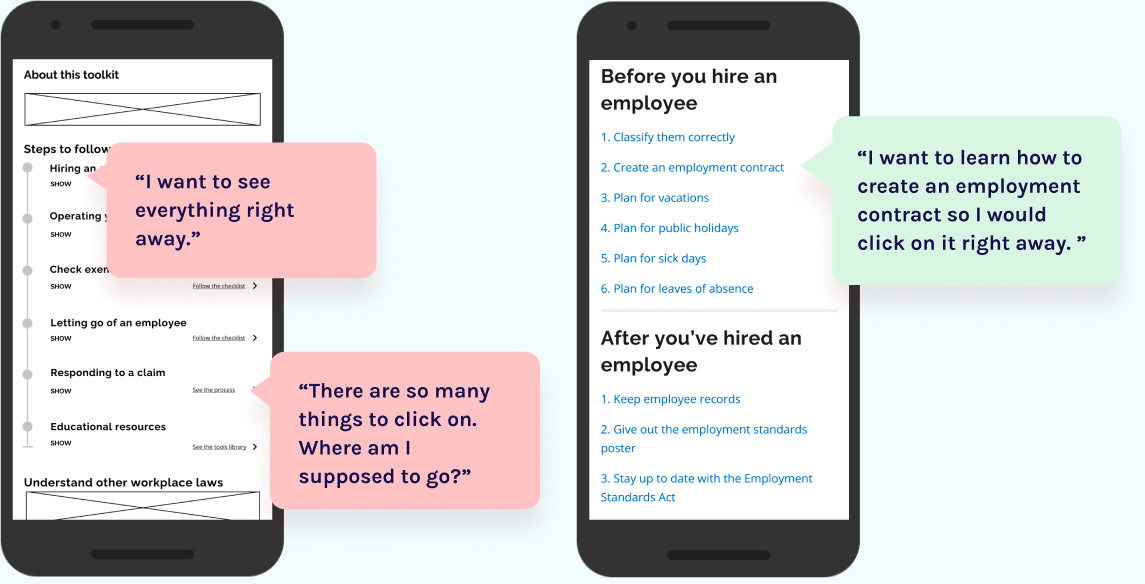
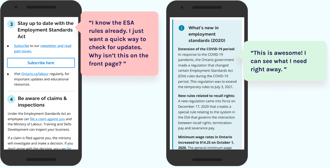
Problem: can't quickly check updates. Many clicks to get to it.
Solution: give people what they need right away on the home page as a banner.
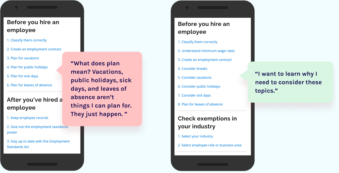
Problem: "plan" is used often but doesn't mean anything to employers.
Solution: replace "plan" with "consider".
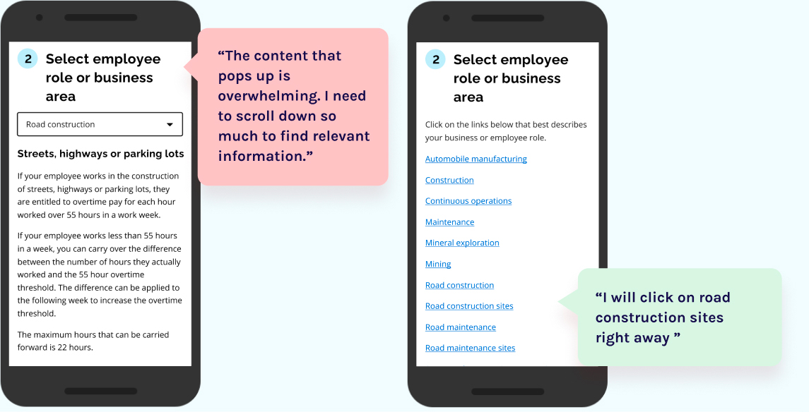
Problem: need to read through many roles in their industry before finding the relevant ones.
Solution: display all exempted roles at once as links.
Voila! Our team went from knowing nothing about the ESA to building this employer toolkit over 6 weeks. Feel free to play around with the prototype and learn all about the employment laws in Ontario!
Using the Ontario Design System, here is our final product! Our team went from knowing nothing about the ESA to building this employer toolkit over 6 weeks.
The project is not complete yet! Unfortunately, my internship ended before the completion of the project. However, my colleagues will continue to support it. I helped identify some of the next steps:
During our user interviews, many employers said they would like a physical copy of the toolkit to use as a checklist. This will also make the toolkit more accessible for everyone.
As identified previously, employers often learn about the ESA too late. A partnership with municipal business registrations and Workplace Safety and Insurance Board will direct employers to the ESA when they register their business.
After launching this toolkit, numbers on non-compliance and calls should be monitored along with stats on Google Analytics. Tripwires should be set to prevent any mishaps.
The toolkit is content-heavy and touches many sensitive legal topics. Through pair writing hosted by the content designer, I observed first-hand how to write simple language without losing the legal meaning as a team.

The toolkit is content-heavy and touches many sensitive legal topics. Through pair writing hosted by the content designer, I observed first-hand how to write simple language without losing the legal meaning as a team.
At the beginning of our project, the client team knew nothing about UX design. Over time, the workshops and co-design sessions helped them gain the necessary UX design mindset and skills. I really enjoyed hosting these workshops for our client because it lets me empower public servants to design future user-centric government services. Teaching others also solidifies my own understanding of design!